The Role of Colors in Setting the Mood and Atmosphere
Colors significantly impact our emotions and can evoke various feelings and moods. Warm colors like red, orange, and yellow tend to create a sense of energy and vibrancy. They can make a room feel cozy, inviting, and lively. Cool colors such as blue, green, and purple, on the other hand, promote calmness, serenity, and relaxation. Neutral colors like white, beige, and gray provide balance and can serve as a backdrop for other accent colors.
Selecting a Color Palette for Relaxation and Warmth
When aiming for a relaxing and warm atmosphere, consider the following tips for selecting a color palette:
Start with a neutral base
Choose a neutral color as the primary hue for your walls or larger furniture pieces. Neutral colors create a versatile, timeless foundation that other colors can easily complement.
Incorporate soothing tones
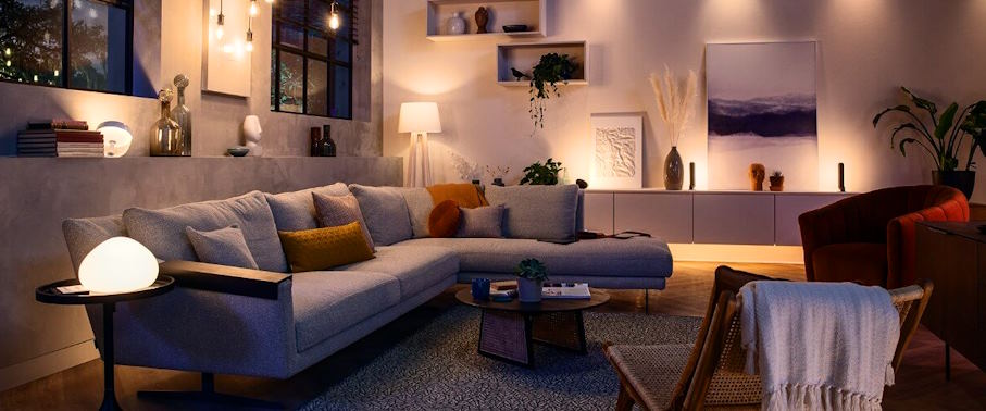
Introduce soothing colors like soft blues, gentle greens, or lavender to promote relaxation. These hues are known for their calming effects and can help create a serene environment.
Embrace warm accents
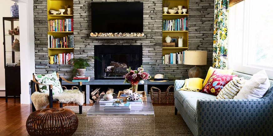
Add warmth to your space by incorporating warm accent colors such as earthy browns, rich oranges, or deep reds. These colors can be used in smaller elements like pillows, curtains, or artwork to create a cozy and inviting atmosphere.
Consider natural elements
Integrating natural elements like wood, stone, or plants can enhance the warmth and relaxation of a room. Earthy tones, such as warm browns and greens, can complement these elements and create a harmonious environment.
Pay attention to lighting
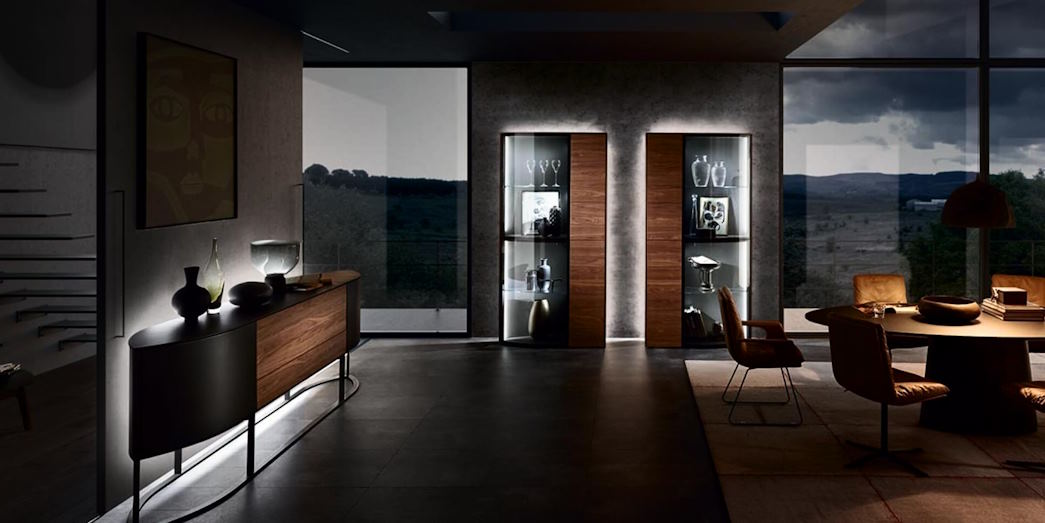
Remember that lighting can affect how colors appear in a room. Natural light tends to enhance the true colors, while artificial lighting can alter the perception of hues. Consider the lighting conditions in your space when selecting colors to ensure they create the desired effect.
Exploring Color Combinations and Their Effects
Different color combinations can produce varying effects in living spaces. Here are a few examples:
Monochromatic
A monochromatic color scheme involves using different shades and tints of a single color. This approach creates a harmonious and soothing effect, especially when using lighter shades. For example, a room with shades of blue can feel serene and calming.
Analogous
Analogous color schemes involve selecting colors adjacent to each other on the color wheel. For instance, combining shades of blue and green creates a sense of tranquility and natural harmony.
Complementary
Complementary colors are opposite each other on the color wheel. Pairing warm and cool tones, such as orange and blue, can create a dynamic and balanced look in a room. However, using these combinations in moderation is important to avoid overwhelming the space.
Recommended To You